Broadband mapping and technology have improved by leaps and bounds in recent years, particularly in critical sectors like education and healthcare. Unfortunately, not everyone gets access to these tech resources, a form of inequity that is fiercely making its presence known as more schools and offices turn to hybrid methods of learning and working. Mapping platforms like Bing Maps API are providing a way to push digital equity, helping governments and businesses make a difference with targeted action.
Identifying underserved areas
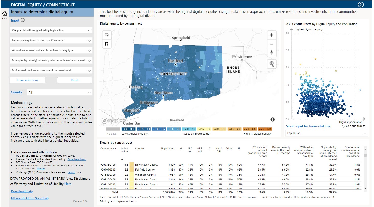
The Digital Equity Data Dashboard is a great example of the map-based push for better digital access. Released by Microsoft to identify areas lagging in broadband access and usage rates, this dashboard aggregates reliable public data from multiple sources like the Census Bureau and the FCC. Featuring minute county-wise information for broadband mapping and up to 20 indicators of digital equity, the dashboard allows users to filter by criteria like median income and households without a desktop or laptop.

A fully interactive map displays all of this data, customized to reflect different levels of digital equity. Users can compare one state to another, or zoom in to compare the equity levels of different counties. This granular mapping complements interactive push pins that pop up to reveal additional information about a particular map tile, including population and ethnicity statistics.
Mapping with Power BI
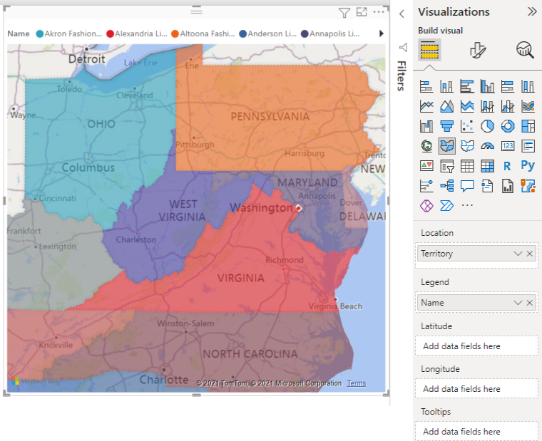
The dashboard is, in large part, made possible by integration with Power BI. Already a robust data visualization software, Power BI can tap into Bing Maps API to create immersive broadband and equity mapping experiences like the Digital Equity Data Dashboard. The geodata stored in Power BI or other Office suite applications like Excel is sent to Bing Maps API, and users can then choose to geocode with several different variables, from postal codes to state territories.
Custom map styles
The same county can report high levels of broadband access on one side of the border and equal levels of scarcity on the other. Just as challenging are scenarios where two districts placed side-by-side report similar but distinct levels of equity. How can that difference be illustrated through a map? The developers of the Digital Equity Data Dashboard chose to use a gradient to show these differences, with subtle contrasts in tone to communicate district-wise equity.

Bing Maps API’s V8 Web Control allows for this level of personalization with support for custom map styles. Users have the power to extensively tweak individual map tile colors, whether that’s adjusting border colors or filling in tiles with highly specific color gradients to represent broadband mapping. The map control also makes customization easier by letting developers specify the particular map elements that they would like to change. Instead of manually filling in every body of water, they can automate it with a single line of code.
Interactive pushpins
Interactive pushpins are easy to add with the V8 Web Control, and they can provide a ton of useful context for the information that the map is presenting. The digital equity dashboard does this by highlighting the selected map tile in a contrasting color before generating a pushpin with all the stats you need to know.
Building together
Carrying out broadband access mapping is a gargantuan task for any individual or even business to undertake alone. Open source projects like OpenStreetMaps play a key role in the success of these social mapping initiatives. Anyone can join in, adding and editing data to create a comprehensive picture of digital equity. Not only does this save an immense amount of time and money, but it also allows people from across the globe to do their part in making the world a better place.
Bing Maps API is open source by design, releasing source code for powerful APIs for free on GitHub while supporting humanitarian projects with high-resolution mapping. One of these projects involves creating high-resolution building footprints, harnessing the power of AI-assisted mapping and machine learning.
These footprints could potentially lead to improved broadband access mapping, for example, digital equity maps could be laid over footprints for a better understanding of infrastructure both in rural and urban areas. The Bing Maps teams have currently supplied about 129,591,852 footprints in the US alone, and more are always being added.
Equity, one map at a time
Open source mapping applications can be a powerful force for good, paving the way ahead for targeted action that drives faster results. Bing Maps API enables these apps with developer-friendly tools that are easy to pick up and build with. Create a free key and explore the platform today.
FAQ
I’ve never worked with mapping apps before, can I still use Bing Maps API?
Developers will always have access to a detailed library of documentation that includes step-by-step walk-throughs for each feature. Add interactive code samples into the mix, and you’ll have support every step along the way.
Are there other samples of how I can use a bing map to help an underserved population or cause?
You can check out the story of how Edgar Simões, an Economist in Portugal, chose to use Bing Maps in Power Pages because he was not a software developer. He created the site UkraineLiveAid.com as an initiative to support Ukrainian refugees in Portugal and you can read more at MS Build 2022 Bing Maps in Microsoft Power Pages. Another great example that leverages shared open data like the Digital Equity map does is Bing's Covid Tracker.
I would like to build my own broadband mapping app, how can I get started?
Small nonprofits, businesses, and individual developers can start building toward digital equity today by creating a Basic key for free. This key unlocks all the features you need to create a robust mapping solution. Visit our licensing page to learn more.

